

Mid-September, Sherwin-Williams named Celery its 2027 Color of the Year, and within a week the chip was taped beside kitchen windows all over the South Sound. In September light it’s a pale green with sun in it. Come back to that chip on a Tuesday in early December, 3 p.m., rain flattening everything outside, and it has gone khaki. Leave the kitchen lights on that night and it turns butter yellow.
The chip itself did not change, but the light around it did. Of all the interior paint colors pitched for 2027, Celery is the one most likely to look different in your house than it did on your phone, and the gap is widest from November through February. Here’s how to tell where it will hold up before you buy five gallons.
Table of Contents
What Sherwin-Williams actually picked
Sherwin-Williams gave Celery the code SW 6421. It announced the color with HGTV Home by Sherwin-Williams on September 15 and calls it a tinted neutral. In other words, it is a green muted enough to behave like a neutral, with a yellow undertone doing most of the work. Its light reflectance value is about 71, which puts it closer to an off-white than to a sage. Sherwin-Williams’ 2027 Color of the Year page has the full palette and sample options.
The Sherwin-Williams Color of the Year 2027 isn’t the only green this fall. Behr chose Grounded, an earthy olive. Benjamin Moore announced Webster Green on October 14, a deeper, classic green. Dulux in the UK went with Soulful Sage. Not everyone followed. Valspar’s Cottage Door is a soft blue and Dutch Boy’s Deep Rooted is a terracotta orange. So the honest read on paint color trends 2027 is green, warmer than the gray sages of the last few years, with blue and clay as the alternates.
Why a gray sky changes a yellow-green
Seattle’s sky is overcast or mostly cloudy about 71 percent of the time in January, and November and December aren’t far behind. That light comes in cool and bluish, and there’s less of it.
Two things happen to Celery. Cool light cancels part of the yellow undertone, and the yellow is what makes Celery read fresh instead of gray. Take it out and you’re left with a muted gray-green. Then low light drains what color is left. A shade with as little saturation as Celery goes flat first, and flat yellow-green is what people describe as olive.
At night, the opposite happens because warm-white bulbs push the yellow forward. The same wall that reads gray-green at 2 p.m. turns buttery by 8 p.m.
The direction a room faces decides how far its color swings.
- North-facing: The grayest and flattest. Sherwin-Williams’ own advice for north-facing rooms is to pick warm undertones to balance the cool light. Celery’s undertone is warm, but on four walls with one window it doesn’t have enough color to fight back.
- East-facing: Fresh in the morning, grayer by mid-afternoon.
- South and west-facing: Closest to the chip. The best rooms for Celery on walls.

Where Celery holds its color best
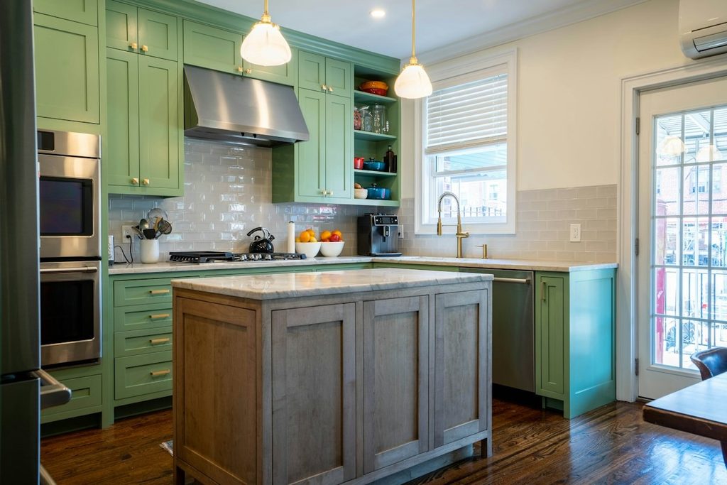
Sherwin-Williams’ color marketing manager told Hunker that Celery is her favorite on kitchen cabinets, especially next to natural wood, and the same piece suggests satin or semi-gloss on woodwork for homes without much natural light. That lines up with what holds up in a Puget Sound winter.
1. Kitchen cabinets
Cabinets are broken into doors and panels, and they sit next to wood counters, white walls, and hardware. Those reference points keep your eye reading green instead of adjusting until the color looks gray. Satin or semi-gloss catches light along every door profile, so the color looks lit even when the room isn’t. Painting kitchen cabinets also means a cabinet-grade enamel, which is built for that sheen anyway.
Before you place the full order, ask for a sample door painted in the final sheen.
2. Trim and doors
Swap Celery in for white trim against warm-white walls, especially in a Craftsman or a 1920s bungalow where the woodwork is the point of the house. Use semi-gloss, which trim needs for wiping anyway.
3. Wainscoting and board-and-batten
This works best on the lower third of a dining room, mudroom, or stairwell. The shadow lines in paneling give the color depth that a flat wall can’t, and the wall above it gives your eye a reference. Satin at minimum, semi-gloss where wet coats and boots hit it.
4. Full walls, in the right room
A south or west-facing living room with real windows can carry Celery on every wall in eggshell. A north bedroom with one window is the room to skip.
If you want a safe start, put Celery on the woodwork first. If you love it there by February, take it to the walls in spring.

Sherwin-Williams interior colors that pair with Celery
Sherwin-Williams built its 2027 palette around Celery. The interior colors in that palette fall into three groups.
- To keep it light: White Flour SW 7102, a warm white, and Woven Wicker SW 9104, a soft neutral.
- For depth: Artichoke SW 6179 and Cocoon SW 6173, two earthier greens, and Georgian Bay SW 6509, a deep blue.
- For accents: Kirsch Red SW 6313, Plum Brown SW 6272, Potentially Purple SW 6821, and Cosmos SW 6528.
For a house that spends winter under cloud, three combinations work. Celery cabinets with White Flour walls. Celery wainscoting with Woven Wicker above. Artichoke on an island under Celery uppers, so the darker green anchors the lighter one. Skip cool blue-grays next to Celery. They pull it grayer.
How we test Celery on your wall first
A two-inch chip under store lighting tells you very little about a north wall in December. Before committing a whole room, follow these steps.
- Use the real surface and sheen: Sherwin-Williams sells sample quarts and peel-and-stick sheets. For a cabinet job, paint a door.
- Go big: A two-foot square at minimum, on primer or a white board so the old color around it doesn’t skew it.
- Test two spots: The darkest wall and the one beside the window.
- Look three times: Mid-morning, mid-afternoon on an overcast day, and at night under your own bulbs. November supplies the overcast day.
- Wait 48 hours: before you decide.
If it holds up at 3 p.m. in December, it’ll hold up in July.

Picking a 2027 color you’ll still like in February
Celery is a good color with a narrower window than the photos suggest. Put it where sheen and contrast can help it, test it in the worst light the house has, and pair it with warm whites rather than cool grays. Winter is also a good time to get the woodwork done, one of the interior jobs worth booking this winter.
Progressive Painting has painted King and Pierce county houses since 1996, and handles interior painting in Seattle too. If you want help choosing among this year’s interior paint colors and someone to sample them on your walls before the first gallon is ordered, call today.
Frequently Asked Questions
What is the Sherwin-Williams Color of the Year 2027?
Celery, SW 6421, announced September 15, 2026, with HGTV Home by Sherwin-Williams. It’s a light green with a warm yellow undertone that Sherwin-Williams calls a tinted neutral, with a light reflectance value around 71.
Does Sherwin-Williams Celery work in a north-facing room?
On cabinets, trim, and wainscoting in satin or semi-gloss, yes. On all four walls of a north room with one window, it tends to read gray or olive from November through February. Sample it on the darkest wall on a cloudy afternoon before you commit.